


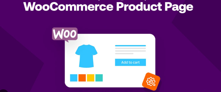
WooCommerce The button design of a website directly affects the buying behavior of users. In this article, we will introduce how to modify the button border color and hover effect, so that "add to cart", "buy now" and other key buttons are more eye-catching, so as to enhance the click-through rate and conversion rate. The method is simple and effective.
![Image [1] - WooCommerce Button Border Color and Hover State Design Tips](http://gqxi.cn/wp-content/uploads/2025/07/20250703161235216-image.png)
I. Why is button design so important?
Buttons are the key to converting users on e-commerce websites. In WooCommerce, a well-designed button can significantly increase the purchase rate. In this article, we will focus on the two most practical button optimization tips: adjusting the "border color" and "hover state" to make your buy button more attractive for customers to click.
II. WooCommerce buttonsBorder Color Design Tips
![Image [2] - WooCommerce Button Border Color and Hover State Design Tips](http://gqxi.cn/wp-content/uploads/2025/07/20250703163700916-image.png)
1. Choose the right color to contrast with the background
The border color of the button needs to contrast with the background color to ensure that the button is clearly visible. For example, buttons with white backgrounds lend themselves to dark borders (such as black or dark gray), while dark backgrounds lend themselves to light borders (such as white or light gray). This helps the button stand out more on the page and draws the user's attention.
Design Recommendations:
- Dark background: Use light borders (e.g., white, gray) or bright colors (e.g., blue, green).
- Light colored background: Use dark borders (e.g. black, dark gray) to enhance contrast.
2. Use brand colors to unify the design
To maintain consistency on your website, the color of the button's border can match the main color of your brand. For example, if your brand color is blue, then the button's border can also have a blue or blue gradient effect to increase the visual recognition of your brand.
Design Recommendations:
- Brand color match: Use the brand's primary color as the button border color (e.g., blue, red, green, etc.).
- Gradient effect: Using a gradient color border can make the button look more modern and dynamic.
3. Dynamic border effect
In addition to static border colors, dynamic border effects, such as changing the color of a border as the mouse passes over it, can provide a richer user experience. Such effects can be implemented through CSS animations or transitions to make buttons more noticeable during user interaction.
Design Recommendations:
- Mouse hover border color change: pass (a bill or inspection etc) CSS (used form a nominal expression)
transitionproperty to achieve a smooth transition of the border color and improve the interactivity of the button. - Bezel thickness variation: The thickness of the border can be made to change when the mouse is hovering, increasing the visual effect and making the button look more layered.
button:hover {
    border-color: #ff6f61;
    transition: border-color 0.3s ease;
}![Image [3] - WooCommerce Button Border Color and Hover State Design Tips](http://gqxi.cn/wp-content/uploads/2025/07/20250703164510902-image.png)
![Image [4] - WooCommerce Button Border Color and Hover State Design Tips](http://gqxi.cn/wp-content/uploads/2025/07/20250703164602129-image.png)
4. Rounded corners combined with a border
Combining border colors with rounded corners can make buttons look softer and easier to click. Buttons with rounded corners are usually more approachable than straight buttons, which can increase the user's desire to click on them.
Design Recommendations:
- Rounded edges: utilization
border-radiusproperty adds a rounded corner effect to buttons. Smaller rounded corners (e.g. 5px) are suitable for normal buttons, while larger rounded corners (e.g. 15px) are more suitable for modern style buttons.
button {
    border-radius: 5px; border: 2px solid #007bff;
    border: 2px solid #007bff;
}![Image [5] - WooCommerce Button Border Color and Hover State Design Tips](http://gqxi.cn/wp-content/uploads/2025/07/20250703164753319-image.png)
Three,WooCommerce Button Hover Status Design Tips
1. Hover state color change
The color of the button should change when the user hovers over the button to provide visual feedback. changes in the Hover state can include background color, border color, text color, etc. to enhance the click-inducing nature of the button.
Design Recommendations:
- Background color change: Use shades of color to emphasize the interactive state of the button. For example, the background color changes from light blue to dark blue, or the background color gradually darkens.
- Text color change: When the background color changes, you can adjust the text color to create a sharper contrast with the background and make the text stand out more.
button:hover {
    background-color: #0056b3;
    color: #fff;
}
2. zoom effect
Another way to enhance the interactive feel of a button is to add a zoom effect to the button when the mouse hovers. By slightly zooming in on the button, users can feel stronger click feedback when clicking.
Design Recommendations:
- Amplify the effect: utilization
transformattribute to zoom in on the button when hovering, and thetransitionSmooth transitions.
button:hover {
    transform: scale(1.05);
    transition: transform 0.2s ease-in-out;
}
The above code can be added via WordPress custom CSS code (works with all themes)
- Login to WordPress Backstage.
- go into exterior condition → customizableThe
![Image [6] - WooCommerce Button Border Color and Hover Status Design Tips](http://gqxi.cn/wp-content/uploads/2025/07/20250703163925895-image.png)
- In the Customization panel, select Additional CSSThe
![Image [7] - WooCommerce Button Border Color and Hover Status Design Tips](http://gqxi.cn/wp-content/uploads/2025/07/20250703165023138-image.png)
IV. Summary and recommendations
Through rational design WooCommerce The border color and hover state of a button can enhance the clickability and user experience of the button. Here are some key tips:
- Border Color Contrast: Ensure that the button borders contrast well with the background color.
- brand color: Use brand colors for visual consistency.
- Hover Status: Add color and zoom effects to hover to enhance interactivity.
- Rounded corner design: Combine rounded corners and edges for added intimacy.

Link to this article:http://gqxi.cn/en/65217The article is copyrighted and must be reproduced with attribution.


![Emoji[jingya]-Photonflux.com | Professional WordPress repair service, worldwide, rapid response](http://gqxi.cn/wp-content/themes/zibll/img/smilies/jingya.gif)

 簡體中文
簡體中文  English
  日本語
日本語  Fran?ais
  Espa?ol


No comments