


When building a WordPress website using the Astra theme, many people would like the navigation bar at the top of the site to remain fixed when scrolling through the page, which implements the so-called "Sticky header"(Sticky Header). However, this feature is only available by default in the Astra Pro available in the version.
If you're not going to pay for an Astra upgrade, then this article will teach you a way to achieve the effect for free -- Sticky Header is easy to implement with simple CSS code, no plugins or Astra Pro required!
What is a sticky header?
Sticky Header (Sticky Header) means: when the user scrolls down the web page, the navigation bar at the top of the website remains fixed and is always displayed at the top of the browser, making it easy for the user to click on the navigation menu at any time.

Ideas: using custom CSS to achieve sticky header effect
Step 1: Login to your WordPress Backend
Go to the backend of your WordPress site and click the exterior condition > customizableThe

Step 2: Open the Extra CSS panel
In the "Customize" interface, click on the left menu of Additional CSS(Additional CSS).

Step 3: Paste the following CSS code
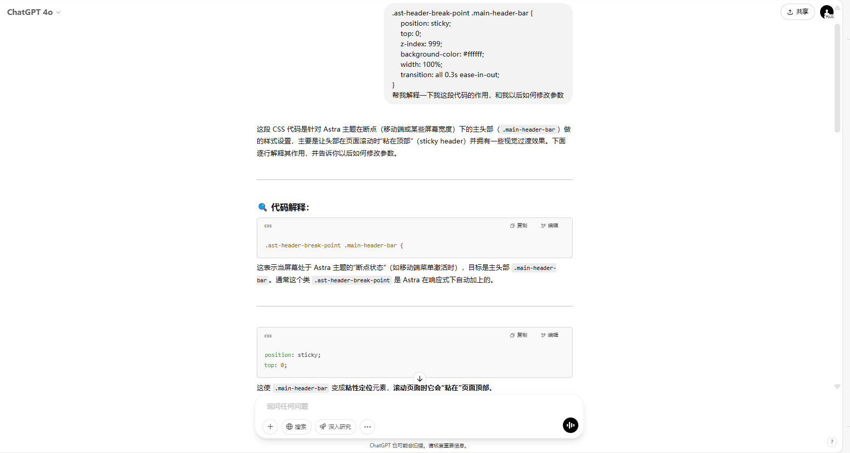
Copy and paste the following code into the CSS editing area:
![Image [4] - Astra theme tutorial: how to create sticky header in free?](http://gqxi.cn/wp-content/uploads/2025/03/20250329151548410-image.png)
.ast-header-break-point .main-header-bar {
    position: sticky;
    top: 0; z-index: 999;
    z-index: 999;
    background-color: #ffffff;
    width: 100%; transition: all 0.3s ease
    transition: all 0.3s ease-in-out;
}
? Immediately after pasting, you see that the top navigation bar has become scrollable and fixed!
Description of optional parameter modifications
The following parameters can be fine-tuned as needed:
top: 0;-- Controls the distance from the top of the page (can be changed totop: 50px;)z-index: 999;-- make sure it covers the rest (don't change it too small)background-color-- Modify the background color in the sticky state (e.g.#000000)transition-- Animation effect when setting up stickiness
If you want to addInner margin padding, you can copy the code below:
.main-header-bar {
    padding-top: 20px;
    main-header-bar { padding-top: 20px; padding-bottom: 20px;
}
Adaptive optimization for mobile (optional)
This code keeps the sticky navigation displaying well on mobile as well.
@media (max-width: 768px) {
  .main-header-bar {
    padding-top: 15px;
    main-header-bar { padding-top: 15px; padding-bottom: 15px;
  }
}
If you don't know CSS, let ChatGPT help you!
If you are not familiar with CSS, you can also copy the above code snippet and let ChatGPT or AI tools help you quickly modify it according to your needs (e.g. changing colors, spacing, shadows), which is perfect for novice users.
summarize
Even if you haven't upgraded to Astra Pro, you can easily implement the sticky header effect on your WordPress website with custom CSS code. The tutorial in this article only needs to add a few lines of code, no plugin can also make the website to realize the function of sticky navigation, to improve the website experience and usefulness. If you want to learn more WordPress-related tutorials and information, please pay attention to thePhoton fluctuation network, has the most comprehensive WordPress tutorials and the most activeWordPress Exchange CommunityThe

Link to this article:http://gqxi.cn/en/48138The article is copyrighted and must be reproduced with attribution.


![Emoji[jingya]-Photonflux.com | Professional WordPress repair service, worldwide, rapid response](http://gqxi.cn/wp-content/themes/zibll/img/smilies/jingya.gif)

 簡體中文
簡體中文  English
  日本語
日本語  Fran?ais
  Espa?ol


No comments